A time series is a sequential record of observations gathered at regular intervals. In the realm of data analysis, time series serves as a potent tool, offering insights into past trends and future projections.
Unlocking the Power of Time Series Analysis
You could either record time series and passively use data for reporting purposes. Or you could analyze time series to make valuable and powerful predictions. Akin to peering into a crystal ball, empowers us to make informed predictions based on historical data.

Key Considerations for Time Series Modeling
When delving into time series modeling, the quality of the model significantly impacts its efficacy. However, more crucial than the model itself is a deep understanding of the problem at hand and its underlying purpose.
It is fundamental to know that when dealing with time series, the future depends on the past. (i.e. Y(t+1) is a function of Y(t).)
Real-Life Applications of Time Series Analysis
Time series data varies in frequency, ranging from seconds to years, and finds applications in diverse domains:
- Seconds: signals processing, web streaming
- Minutes: customer service calls, gas demand
- Hourly: weather forecasting
- Daily: pandemic pathogens propagation
- Weekly: sales
- Monthly: inventory control
- Quarterly: tax payments
- Yearly: climate change, budgeting
Handling Time Series the wrong way?
While Excel trend lines are commonly used for time series analysis, they often lack robustness and accuracy. Opting for advanced algorithms and seeking assistance from time series professionals is advisable for critical modeling tasks.
Advanced Time Series Handling - Overcoming Challenges
Challenges in time series analysis include stationarity, trends, seasonality, and understanding endogenous versus exogenous variables.
Endogenous variables are the opposite of exogenous variables. Endogenous variables are influenced by other variables in the system (including themselves). Exogenous variables can have an impact on endogenous factors. Exogenous variables are not influenced by other variables in the system and on which the output variable depends. For simplicity, we will consider only endogenous variables.
Stationarity, in particular, requires careful consideration and can be assessed using various techniques such as the Augmented Dickey-Fuller test.
Practical Steps for Time Series handling:
Inspecting the data, identifying trends and seasonality, checking for missing or outlier values, and ensuring stationarity are crucial preliminary steps. Subsequently, selecting an appropriate model and evaluating its performance using criteria like AIC, BIC, and MSE is essential.
- Inspect the data
- Check for trends (graph all the data)
- Check for seasonality (graph a small subset of the data i.e. one year of monthly series)
- Check for missing values
- Check for zero values
- Check for outliers
- Check for Stationarity
- Augmented Dickey-Fuller
- Segmented Random Mean constant stability verification
- Segmented Random Variation constant stability verification
- Check for Seasonality
- Select the model
- Simple Trend Line
- AR model
- MA model
- ARMA model
- ARIMA model
- SARIMA model
- SARIMAX model
- Select performance criteria
- AIC
- BIC
- MSE
- Plot the predicted / forecast vs actual
Exploring a Real-World time series Dataset
To illustrate time series analysis concepts, we'll utilize the CO2 Carbon Dioxide Time-Series dataset. This dataset spans from 1965 to 2004, comprising 480 monthly observations. It exhibits seasonality, trends, and stationarity, making it an ideal candidate for modeling exercises.
This level of complexity requires a great deal of manipulation and full usage of the ARIMA model. A good exercise and a happy medium between beginner and advanced forecasting analysis. We recommend inspecting the data before usage.
To download the data, click here, You could find the official and updated Time Series for carbon dioxide at the NOOA website. https://gml.noaa.gov/ccgg/trends/mlo.html
Time series analysis is a powerful tool for extracting valuable insights and making informed predictions from sequential data. By following best practices and leveraging appropriate techniques, analysts can unlock the full potential of time series data in various domains.
Step 1 Time Series Inspection
Inspecting time series data is the first step towards unlocking its insights. By visualizing the data, time series analysts gain valuable insights into trends, seasonality, and potential patterns. In our analysis, we'll use Python for data visualization and analysis.
Code Fragment for Data Plotting the time series:
import pandas as pd
# when naming files i usually use ts for time series and frequency i.e. monthly
df = pd.read_csv('ts_co_monthly.csv')

co = df['co'].values

# Plot Data
from matplotlib import pyplot as plt
plt.plot(co, color='green', label='TS Actual')
plt.title("carbon dioxide Time Series Analysis", color='red', loc='left')
plt.xlabel("dummy index")
plt.ylabel("carbon dioxide")
plt.legend()
plt.show()
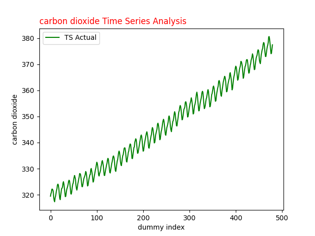
Fig.1 Carbon dioxide Time Series for analysis with ARIMA
Interpreting the Time Series Plot:
The plotted at Fig.1 time series data reveals insights into carbon dioxide levels over time. Notably, the graph exhibits an upward trend saw tooth with seasonal fluctuations, indicating both long-term trends and short-term variability.
Zooming in for Seasonal Analysis:
To better understand the seasonal effect, we'll zoom in on a subset of the data, focusing on a 36-month period.
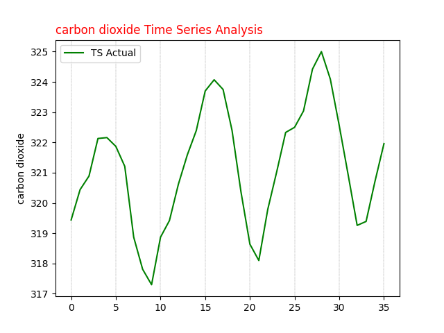
Fig. 2 carbon dioxide time series analysis 36 months seasonal plot
Step 2 Stationarity Analysis for Time Series
Ensuring the stationarity of time series data is pivotal for accurate modeling. When applying ARIMA to analyze a time series, we assume that the observations being modeled are stationary. One common method to verify stationarity is by assessing the constancy of mean and variance across the dataset.
We employ the Augmented Dickey-Fuller test, a widely accepted method in time series analysis, to determine stationarity. Once understood, this testing method is efficient and could be programmatically automated. Let's delve into the results of this test:
import pandas as pd

df = pd.read_csv('ts_co_monthly.csv')

# Note the data is monthly
co = df['co'].values

from statsmodels.tsa.stattools import adfuller
def ADF_Function(timeseries):
    adfTest = adfuller(timeseries)
    if adfTest[1] < 0.05:
        print('Stationary p-value: %.5f' % adfTest[1])
    else:
        print('Not Stationary p-value: %.5f' % adfTest[1])
    print('# of lags: %.0f' % adfTest[2])
    print('# of Observations: %.0f' % adfTest[3])
    print('ADF Statistic: %.3f' % adfTest[0])
    print('Critial Values:')
    for key, value in adfTest[4].items():
        print('\t%s: %.3f' % (key, value))

# ADF Test Original Data
ADF_Function(df['co'].values)

# ADF Test 1st Order
ADF_Function(df['co'].diff().dropna())
Results of ADF Test:
For the original dataset, the p-value exceeds 0.05, and the ADF statistic is 1.911, indicating non-stationarity. However, after 1st differencing, the ADF statistic becomes -4.498, lower than the 5% critical value, with a corresponding p-value below 0.05, confirming stationarity.
Hint: The original dataset comprises 466 observations, while after differencing, it reduces to 465 observations. As a final check, a plot Fig. 3 of the 1st differencing illustrates oscillations around zero without discernible trends.
# Results of ADF Test on the original series
Not Stationary p-value: 0.99855
# of lags: 13
# of Observations: 466
ADF Statistic: 1.911
Critial Values:
	1%: -3.444
	5%: -2.868
	10%: -2.570

# Results of ADF Test after 1st Differencing
Stationary p-value: 0.00020
# of lags: 13
# of Observations: 465
ADF Statistic: -4.498
Critial Values:
	1%: -3.444
	5%: -2.868
	10%: -2.570
In order to determine the model, a quick visual inspection of the data series is required. Next, we will generate a quick Python code and some plots to better understand the data. The plots will include 1st order differencing and 2nd order differencing and the associated autocorrelation plots known as ACF and PACF plots.
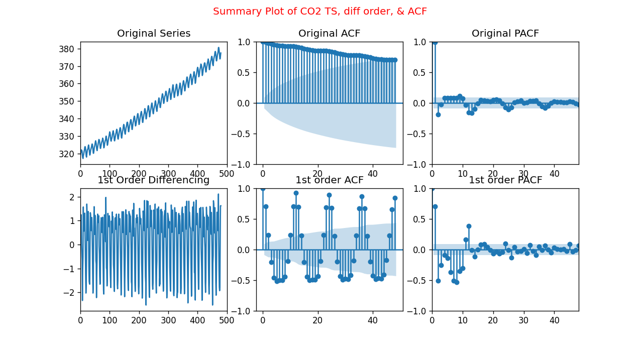
Fig.3 Summary of Carbon Dioxide Time-Series Differencing, ACF, and PACF plots
Visualizing Stationarity and Autocorrelation:
To gain further insights, we visualize the stationarity and autocorrelation of the time series data:
import pandas as pd

df = pd.read_csv('ts_co_monthly.csv')

# Note the data is monthly
co = df['co'].values

from matplotlib import pyplot as plt
from statsmodels.graphics.tsaplots import plot_acf, plot_pacf

DIFFACF = 'Yes'
if DIFFACF == 'Yes':
    cstmz = {'figure.figsize': (9, 7),
             'figure.dpi': (120),
             }
    plt.rcParams.update(cstmz)
    fig, axes = plt.subplots(2, 3, sharex=False)
    fig.suptitle('Summary Plot of CO2 TS, diff order, & ACF \n', color='red')

    axes[0, 0].plot(df['co'].values)
    axes[0, 0].set_title('Original Series')
    axes[0, 0].set(xlim=(0, 500))
    plot_acf(df['co'].values, lags=48, ax=axes[0, 1])
    axes[0, 1].set_title('Original ACF')
    plot_pacf(df['co'].values, lags=48, ax=axes[0, 2], method="ywm")
    axes[0, 2].set_title('Original PACF')
    axes[0, 2].set(xlim=(0, 48))

    # 1st Differencing
    axes[1, 0].plot(df['co'].diff())
    axes[1, 0].set_title('1st Order Differencing')
    axes[1, 0].set(xlim=(0, 500))
    plot_acf(df['co'].diff().dropna(), lags=48, ax=axes[1, 1])
    axes[1, 1].set_title('1st order ACF')
    plot_pacf(df['co'].diff().dropna(), lags=48, ax=axes[1, 2], method="ywm")
    axes[1, 2].set_title('1st order PACF')
    axes[1, 2].set(xlim=(0, 48))

    plt.show()
These plots provide valuable insights into the structure and autocorrelation of the time series data, aiding in the selection of appropriate ARIMA parameters.
What is ARIMA?
Understanding ARIMA, it is an acronym for AutoRegressive, Integrated, and Moving Average. It is fundamental for time series analysis and It comprises three components:
- AR: Autoregression. A model that uses the dependent relationship between a current observation and some number of previous (lagged) observations. Age regression occurs when someone reverts to a younger state of mind.
- I: Integrated. The step of differencing the raw observations (e.g. subtracting an observation from previous observations). Represents differencing, the process of making the time series stationary
- MA: Moving Average. As the name implies, it is the average of a subset propagating along with the data series applied to the residual. A model that uses the dependency between an observation and an error from a moving average.
The ARIMA function is used as ARIMA(p,d,q). The argument also called parameter inside the function takes integer values.
- p: Called the lag order or lag, the number of lags included in the model.
- d: Called differencing degree. The number of times that the raw observations are differenced.
- q: Called the order of moving average. The number of data points being averaged in each step.
Step 3 ARIMA time series selection criteria
To select an appropriate ARIMA model, several steps are involved. First, the data must be made stationary, in our case, after 1st difference the dataset is stationary. Then, the order of the Moving Average (MA) and Auto-Regressive (AR) components is determined from the Autocorrelation Function (ACF) and Partial Autocorrelation Function (PACF) plots.
Fig. 3 illustrates the ACF and PACF plots, aiding in determining the applicability of the ARIMA model. Notably, a decaying ACF plot suggests an MA model, while significant lags exceeding the shaded limit in the PACF plot indicate an AR model.
Once the potential parameters are identified, a series of ARIMA models are tested, varying parameters (p and q) to find the best fit and least error. However, selecting the optimal model can be challenging due to the combination of art and science involved in interpreting ACF and PACF plots.
Looking at the 1st order differencing PACF plot, the first significant lags occur at 1, 8, or 12. This indicates that our model could be AR(1), AR(8), or AR(12).
Similarly, by inspecting the 1st order differencing ACF plot, the first significant lags occur at 2, 8, or 50. This indicates that the model could be MA(2), MA(8), or MA(50) as shown in Fig. 4.
For all practical purposes, MA(50) is unheard about.
When dealing with Time Series ARIMA simpler is usually better, when in doubt take the smaller order.
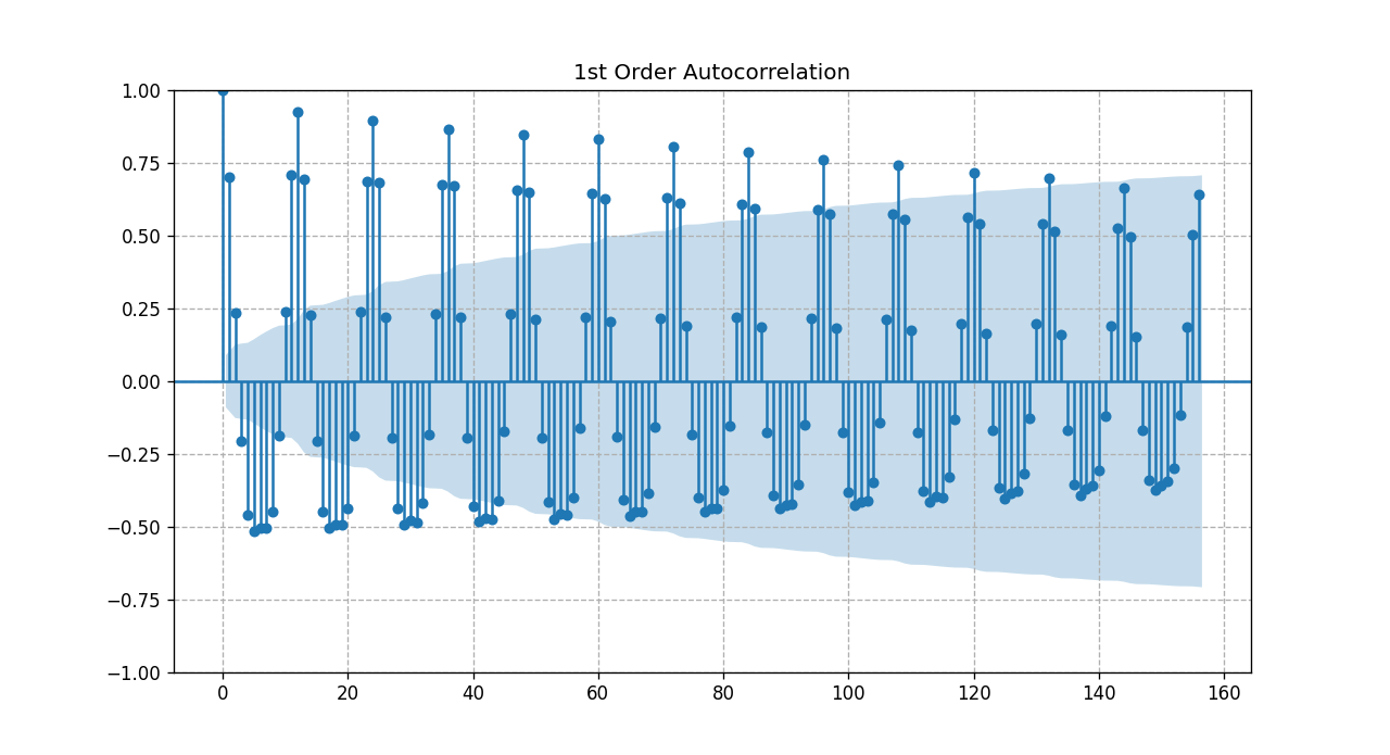
Fig. 4 zoomed time series ACF after 1st_order differencing
Based on the previous discussions we will consider a combination of ARIMA models. We will vary the parameters p & q where P= (1,8, or 12), and q = (2 or 8)
So we will test
ARIMA (1,1,2), ARIMA (1,1,8), ARIMA (8,1,2), ARIMA (8,1,8), ARIMA (12,1,2), ARIMA (12,1,8)
Obviously, the model selection criteria will be based on the model that yields the best fit and least error. Later we will explain where it gets challenging and the importance of doing the right thing
Although ARIMA analysis is scientific, it sometimes involves following protocols and accepting a given result. However, exceptions exist, particularly when dealing with seasonality.
For instance, in cases of monthly seasonality, a manual test with specific parameters is necessary. The provided code demonstrates the manual testing process for ARIMA model parameters, aiding in effective time series analysis.
Initially, we run a loop through several values of p,d,q and selected the trio that provided the least AIC value, the algorithm seemed to converge much faster before looping through p=12, and q=8. The chosen parameters p,d,q were (2,1,1) and the AIC value was 778.67. Numerically that made sense as the simpler model is always preferred for production.
Upon plotting the graph, the model did not seem to provide robust output. The reason behind that is the fact of seasonality. At which point SARIMAX is usually a better performing algorithm to manage seasonality. This article is about ARIMA so we will add another publication to address SARIMAX.
Since we know the model has monthly seasonality we manually test the model for the parameters p,d,q = (12,2,8) as shown in the following code.
import pandas as pd
from datetime import datetime
import matplotlib.pyplot as plt

def parser(s):
    return datetime.strptime(s, '%Y-%m')

ts = pd.read_csv('ts_co_monthly.csv', header=0, index_col=0,
                 parse_dates=True, date_parser=parser)

ts.index = ts.index.to_period('M')

# Note the data is monthly
co2 = ts[:]
train, test = ts[:386], ts[386:480]

ordr = (12, 2, 8)
# now lets build the ARIMA Model
from statsmodels.tsa.arima.model import ARIMA
ts1 = ARIMA(train, order=ordr)
ts_model = ts1.fit()
print(ts_model.summary())

pred_start, pred_end ='1997-01', '2004-12'

pred = ts_model.get_prediction(start=pred_start, end=pred_end,  dynamic=False)
pred_conf_intv = pred.conf_int()

frct = ts_model.get_forecast(steps=204)
frct_conf_intv = frct.conf_int()

lower_frct = frct_conf_intv.iloc[:, 0]
upper_frct = frct_conf_intv.iloc[:, 1]

p,d,q = ordr
plttl = 'CO2 TS Analysis ARIMA ('+ str(p)+ ','+ str(d)+ ','+ str(q)+ ')'

co2['co'].plot(label='Actual', alpha=.6)
pred.predicted_mean.plot(label='Predict')
frct.predicted_mean.plot(label='Forecast')

plt.fill_between(frct_conf_intv.index, lower_frct,
                upper_frct, color='k', alpha=.2)
plt.title(plttl)

plt.ylabel('CO2 parts per million (ppm)')
plt.xlabel('Date')
plt.legend()
plt.show()
Note The statsmodel prediction package offers four distinct prediction functions, interchangeable based on requirements.
Prediction vs Forecasting
In time series analysis, distinguishing between prediction and forecasting is crucial for accuracy and clarity in code implementation.
Prediction vs. Forecasting Methods:
We employ distinct methods for in-sample prediction and out-of-sample forecasting to maintain code organization and readability.
-
Prediction: Utilizing methods like
predictandget_prediction, we make in-sample predictions. These methods are particularly useful for assessing model robustness. -
Forecasting: For out-of-sample estimates, methods such as
forecastandget_forecastare employed. These methods generate forecasts based on the trained model and provide confidence intervals, enhancing the reliability of predictions.
These keeps our code clean and much easier to read.
Model Evaluation:
Examining the report summary of our model reveals key metrics and statistics essential for evaluation.
When done correctly both methods provide confidence intervals shown as the filled shaded area in the graph
-
The AIC (Akaike Information Criterion) value serves as an indicator of model fit. In our case, the initial AIC value is 261.899.
-
By experimenting with different parameter values, particularly adjusting q, we achieved a lower AIC value of 229.51, indicating improved model fit. However, further details on this experimentation are left for deeper exploration.
-
It's important to note that AIC values are specific to our dataset and influenced by factors like training dataset size. In our case, we considered 386 observations out of 4
Model Coefficients and Significance:
The coefficients for Autoregressive (AR) and Moving Average (MA) components provide insights into the model's structure. These coefficients can be utilized for manual calculations and analysis.
-
Examining the coefficients reveals approximately 20 parameters, emphasizing the need for a simpler model.
-
Note that while some p-values such as ma.L2 may exceed the desired confidence level of 0.05, the 95% desired confidence level, for simplicity's sake, we don't delve into discussing these exceptions in this article.
     SARIMAX Results
==============================================================================
Dep. Variable:                     co   No. Observations:                  386
Model:                ARIMA(12, 2, 8)   Log Likelihood                -109.949
Date:                Wed, 15 May 2019   AIC                            261.899
Time:                        12:41:57   BIC                            344.862
Sample:                    01-31-1965   HQIC                           294.806
                         - 02-28-1997
Covariance Type:                  opg
==============================================================================
                 coef    std err          z      P>|z|      [0.025      0.975]
------------------------------------------------------------------------------
ar.L1         -0.3528      0.169     -2.084      0.037      -0.685      -0.021
ar.L2         -0.3105      0.161     -1.925      0.054      -0.627       0.006
ar.L3         -0.5920      0.139     -4.259      0.000      -0.865      -0.320
ar.L4         -0.3147      0.163     -1.926      0.054      -0.635       0.006
ar.L5         -0.5578      0.140     -3.988      0.000      -0.832      -0.284
ar.L6         -0.3135      0.147     -2.137      0.033      -0.601      -0.026
ar.L7         -0.4624      0.163     -2.840      0.005      -0.782      -0.143
ar.L8         -0.5126      0.113     -4.549      0.000      -0.734      -0.292
ar.L9         -0.3463      0.154     -2.245      0.025      -0.649      -0.044
ar.L10        -0.5103      0.136     -3.762      0.000      -0.776      -0.244
ar.L11        -0.2332      0.147     -1.590      0.112      -0.521       0.054
ar.L12         0.3058      0.115      2.658      0.008       0.080       0.531
ma.L1         -0.8645      0.174     -4.957      0.000      -1.206      -0.523
ma.L2         -0.0934      0.160     -0.583      0.560      -0.408       0.221
ma.L3          0.2017      0.173      1.166      0.243      -0.137       0.541
ma.L4         -0.2108      0.165     -1.276      0.202      -0.535       0.113
ma.L5          0.3271      0.154      2.129      0.033       0.026       0.628
ma.L6         -0.2169      0.137     -1.582      0.114      -0.486       0.052
ma.L7          0.2023      0.127      1.590      0.112      -0.047       0.452
ma.L8         -0.2853      0.099     -2.868      0.004      -0.480      -0.090
sigma2         0.0990      0.009     10.887      0.000       0.081       0.117
===================================================================================
Ljung-Box (L1) (Q):                   0.19   Jarque-Bera (JB):                 0.24
Prob(Q):                              0.66   Prob(JB):                         0.89
Heteroskedasticity (H):               0.81   Skew:                             0.06
Prob(H) (two-sided):                  0.23   Kurtosis:                         2.97
===================================================================================
Forecasting Visualization:
The forecasting of carbon dioxide concentration using a simple ARIMA model is visually represented. The plot showcases the actual dataset, in-sample predictions for model robustness testing, and the forecast with a shaded area denoting confidence intervals.
It's crucial to understand that the forecast begins at the end of the training subset, and in practical applications, the entire dataset is utilized to compile the model.
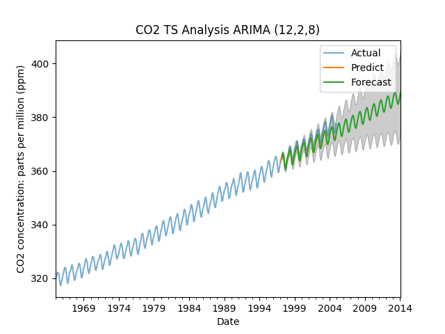
Fig 7 Carbon Dioxide Concentration Forecast with ARIMA
Final Notes: This article prioritizes clarity and understanding, aiming to empower readers with practical insights into time series analysis using ARIMA. As the field of data science evolves rapidly, with frequent updates to software packages, it's essential to remain adaptable. We anticipate making edits to code fragments as necessary to keep pace with advancements in the field.